Doing a world of good, better.
Conrad N. Hilton Foundation and Movember Foundation (US)
Two nonprofits. Two distinct missions.
One tackles systemic poverty, displacement and access to basic needs.
The other confronts stigma, silence and the hidden toll of men’s health.
Both needed to communicate big visions and life-changing impact in a world where everything competes for attention.
Reading the room
We started from behavior, not formats. For the Hilton Foundation, we treated the website as a central hub and mapped who arrives, from where, and what they try to do next. For Movember, we positioned the annual report as a flagship touchpoint and analyzed how decision makers, donors and supporters move through it.
In both cases, our goal was the same: give each audience a clear way in and keep them engaged, so that programs, people and impact don’t just appear on a page, they register.
Building better pathways
For the Hilton Foundation, we rebuilt the website architecture around what visitors actually come to do: understand the foundation, explore programs and grantmaking, see impact, dive into real life stories. Clear sections and strategic CTAs turned a static site into a set of intentional entry and exit points that naturally guide people forward.
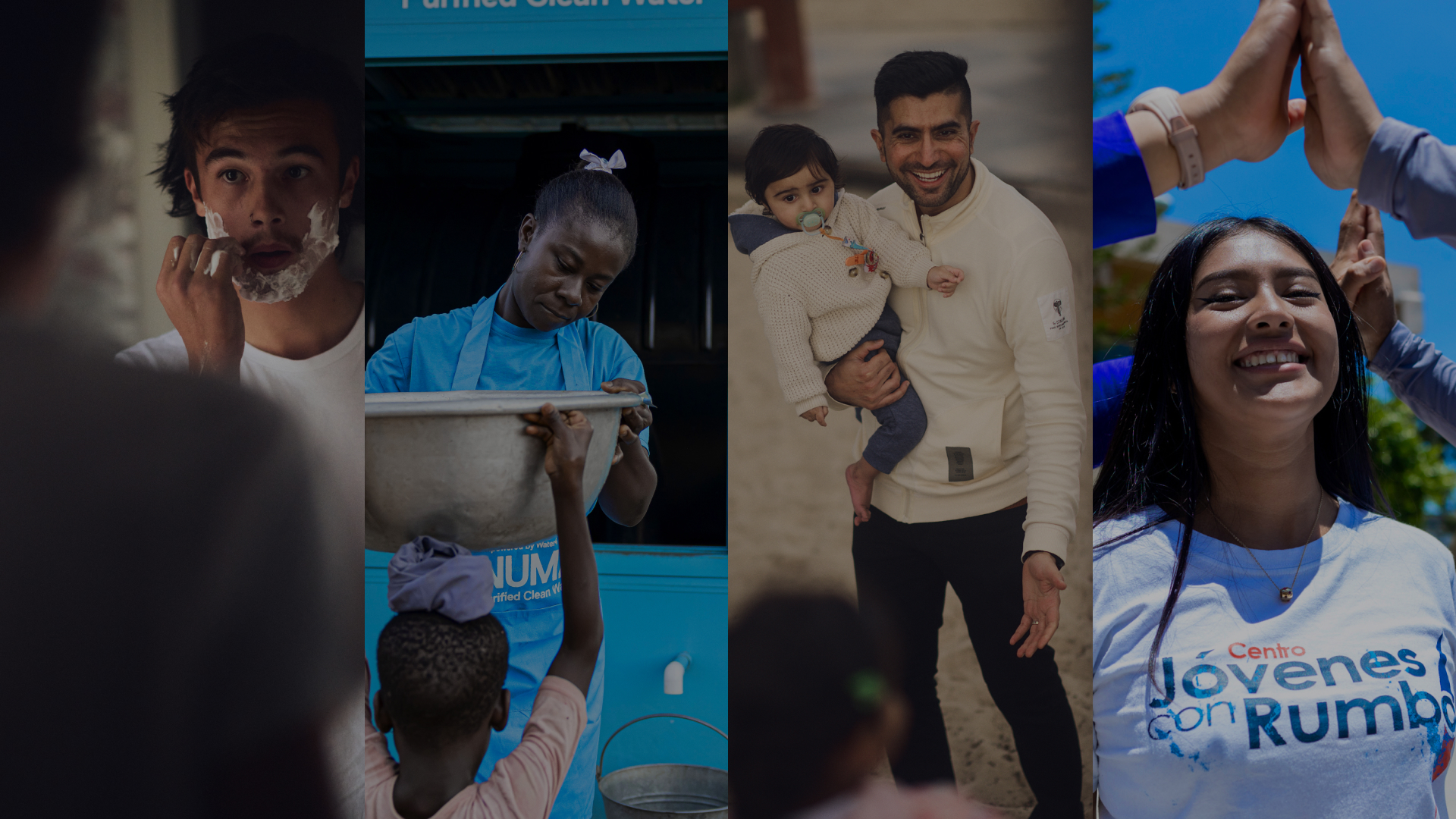
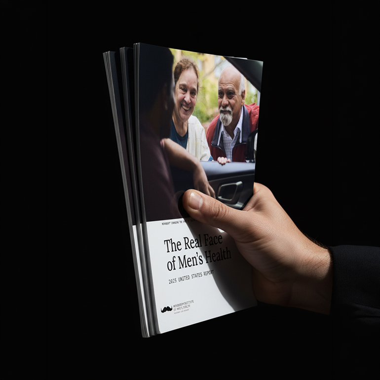
For Movember, we reshaped the Real Face 2024 report so data and stories speak to each other. Numbers and narratives alternate, showing how men’s health ripples through families, relationships and communities, connecting individual experiences to the systems around them.
Making impact impossible to miss
A shift from a generic institutional layout to a bold, modular design gave the Hilton Foundation website a whole new presence. Strong headlines, distinct color contrasts and photography focused on people and outcomes put impact front and center.
Putting faces to the data
An evolved visual language featuring large color portraits, collage compositions and chapter-based palettes weaves Movember’s annual report together. Reframing multiple shots of the same person or family, we let personalities and relationships emerge, making men’s health disparities feel tangible and human.
Showing up when people go looking
A website that doesn’t show up in search queries is – for most users – a site that doesn’t exist.
For the Hilton Foundation, we didn’t just rewrite content – we rebuilt it for discoverability. Honing in on strategic keywords, we crafted pages to appeal to both humans and search engines, with titles, descriptions and alt text that make programs, stories and resources easier to surface, while ensuring readability and accessibility on every page.
Highlighting impact, one scroll at a time
An executive summary can be more than a short version of a long report.
For Movember, we turned the most important insights from the annual report into a scrollytelling experience designed to draw people in. Key highlights are staged in a bold, animated journey that reflects Movember’s tone of voice and keeps users curious, leading them towards the full report. This digital native approach goes far beyond a static PDF, while overcoming the technical and SEO limits of the previous impact hub.